深色模式
Flutter 主题设置
全局主题 ThemeData
在MaterialApp中,可以全局设置应用的主题样式:
dart
MaterialApp(
    theme: ThemeData(), // 明亮主题
    darkTheme: ThemeData(), // 黑暗主题
    themeMode: ThemeMode.system, // 主题模式
);所有配置细节,都在ThemeData对象中。
配置可以分以下几类:
- 颜色
- 文字与图标
- 通用配置
- 组件样式
颜色
关于 Material 3 颜色
Material 3 设计标准,定义了应用中颜色的划分、如何处理对比度、分割线、阴影等。
最新的 Flutter 版本,默认使用 Material 3 标准。
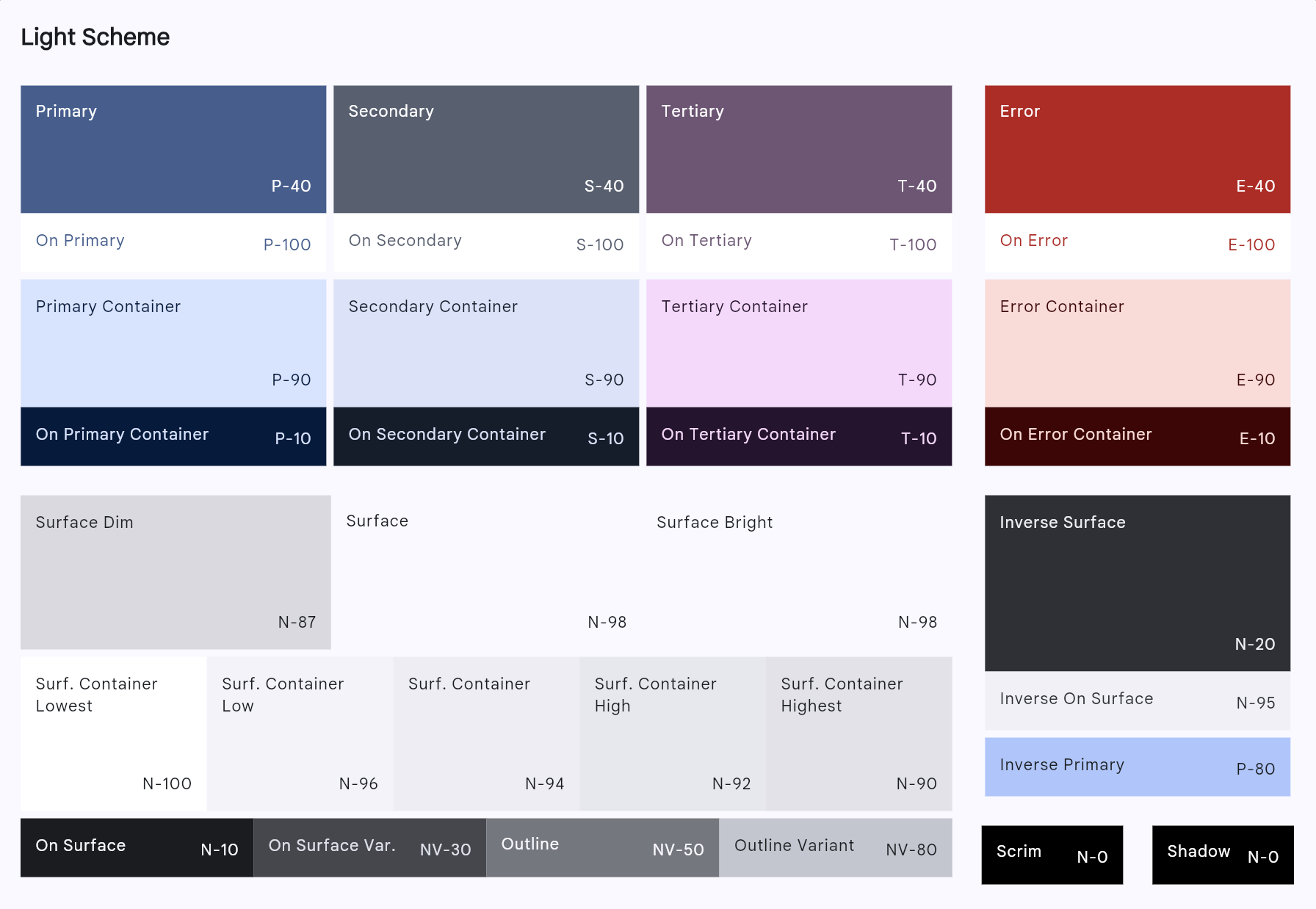
Material 3 浅色主题示例:
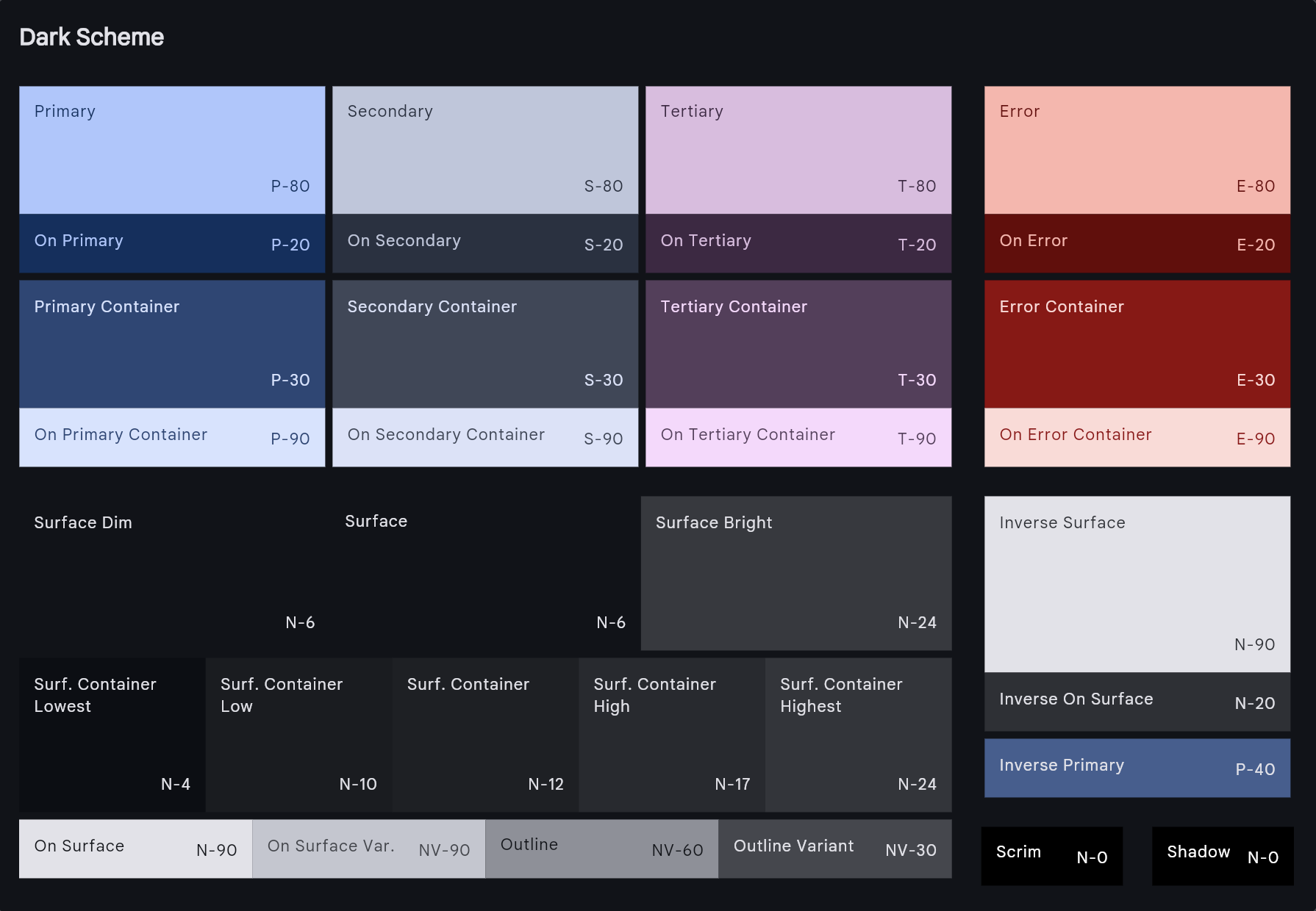
Material 3 深色主题示例:
主题颜色参数
颜色配置,使用colorScheme参数:
dart
ThemeData({
  colorScheme: ...,
  // ...,
});在colorScheme下面还有一系列的颜色相关的参数,这些是Material 2的标准,目前已过时,按照官方说法,以后将逐渐弃用。
所以,设置颜色仅指定ThemeData中colorScheme参数,关键就在于,构造这个colorScheme对象。
ColorScheme
构造函数
ColorScheme才是一个APP主题样式的灵魂,它有几个构造函数:
ColorScheme():逐一设置各个主题颜色(最原始的方法)ColorScheme.fromSeed():从1个种子色创建一套主题色(方便但不强大)ColorScheme.light():预设轻主题,主色是紫色(一般用于 Hello World 项目)ColorScheme.dark():预设暗主题,主色是浅紫色(一般用于 Hello World 项目)ColorScheme.highContrastLight():预设高对比轻主题(一般用于 Hello World 项目)ColorScheme.highContrastDark():预设高对比暗主题(一般用于 Hello World 项目)ColorScheme.fromSwatch():从几个样板色创建一套主题色(不适合 Material 3,弃用)
实际上,最实用的构造函数,仅一个:
ColorScheme.fromSeed():其它的各位构造函数都是乐色!
整体的明暗、对比度、色板
dart
ThemeData(
  colorScheme: ColorScheme.fromSeed(
    brightness: Brightness.light,
    contrastLevel: contrastLevel,
    dynamicSchemeVariant: DynamicSchemeVariant.tonalSpot,
    // ...
  ),
)
参数说明:
brightness: 浅色或深色contrastLevel: 对比度,范围是[-1, 1],默认是0。dynamicSchemeVariant: 枚举类型,指定色板计算方式,默认是tonalSpot。dartenum DynamicSchemeVariant { /// 默认选项。构建柔和的调色板,具有低饱和度(chroma)。 tonalSpot, /// 生成的调色板与种子颜色匹配,即使种子颜色非常明亮(高饱和度)。 fidelity, /// 所有颜色为灰度,无饱和度。 monochrome, /// 接近灰度,带有一丝饱和度。 neutral, /// 柔和的颜色,高饱和度调色板。主调色板的饱和度达到最大值。 /// 如果需要根据调色板的鲜艳度调整色调,建议使用 `fidelity`。 vibrant, /// 柔和的颜色,中等饱和度调色板。主调色板的色相与种子颜色不同,带来更多变化。 expressive, /// 与 `fidelity` 几乎相同。Tokens 和调色板与种子颜色匹配。 /// [ColorScheme.primaryContainer] 为调整后的种子颜色,以确保与表面颜色形成对比。 /// 第三调色板(tertiary palette)为种子颜色的类似色(analogous)。 content, /// 彩虹,一个充满趣味的主题——种子颜色的色相不会出现在主题中。 rainbow, /// 水果沙拉,一个充满趣味的主题——种子颜色的色相不会出现在主题中。 fruitSalad, }
颜色角色
仅指定seedColor即可生成全套46色:
dart
ThemeData(
  colorScheme: ColorScheme.fromSeed(
    seedColor: Colors.blue,
    // ...
  ),
)
46个颜色角色(Color role)如下,如果非空,会覆盖自动生成的值:
46色预览
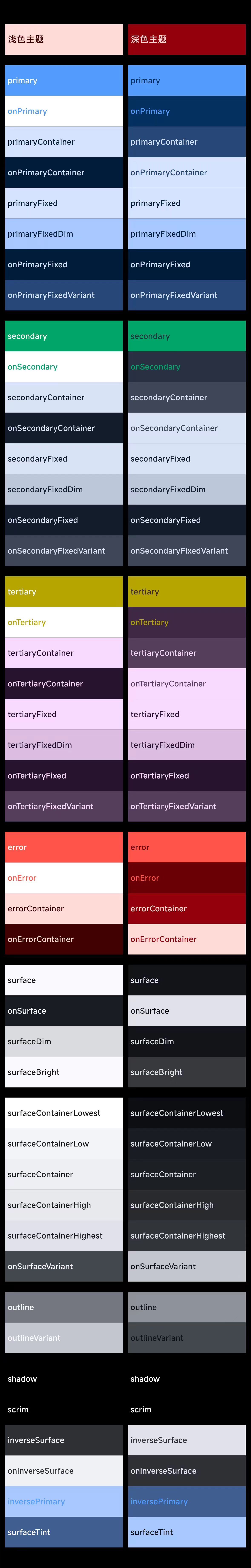
dart
Color? primary,
Color? onPrimary,
Color? primaryContainer,
Color? onPrimaryContainer,
Color? primaryFixed,
Color? primaryFixedDim,
Color? onPrimaryFixed,
Color? onPrimaryFixedVariant,
Color? secondary,
Color? onSecondary,
Color? secondaryContainer,
Color? onSecondaryContainer,
Color? secondaryFixed,
Color? secondaryFixedDim,
Color? onSecondaryFixed,
Color? onSecondaryFixedVariant,
Color? tertiary,
Color? onTertiary,
Color? tertiaryContainer,
Color? onTertiaryContainer,
Color? tertiaryFixed,
Color? tertiaryFixedDim,
Color? onTertiaryFixed,
Color? onTertiaryFixedVariant,
Color? error,
Color? onError,
Color? errorContainer,
Color? onErrorContainer,
Color? outline,
Color? outlineVariant,
Color? surface,
Color? onSurface,
Color? surfaceDim,
Color? surfaceBright,
Color? surfaceContainerLowest,
Color? surfaceContainerLow,
Color? surfaceContainer,
Color? surfaceContainerHigh,
Color? surfaceContainerHighest,
Color? onSurfaceVariant,
Color? inverseSurface,
Color? onInverseSurface,
Color? inversePrimary,
Color? shadow,
Color? scrim,
Color? surfaceTint,
对它们分类:
- 主色(8个)
dart
Color? primary,
Color? onPrimary,
Color? primaryContainer,
Color? onPrimaryContainer,
Color? primaryFixed,
Color? primaryFixedDim,
Color? onPrimaryFixed,
Color? onPrimaryFixedVariant,- 第二色(8个)
dart
Color? secondary,
Color? onSecondary,
Color? secondaryContainer,
Color? onSecondaryContainer,
Color? secondaryFixed,
Color? secondaryFixedDim,
Color? onSecondaryFixed,
Color? onSecondaryFixedVariant,- 第三色(8个)
dart
Color? tertiary,
Color? onTertiary,
Color? tertiaryContainer,
Color? onTertiaryContainer,
Color? tertiaryFixed,
Color? tertiaryFixedDim,
Color? onTertiaryFixed,
Color? onTertiaryFixedVariant,- 错误色(4个)
dart
Color? error,
Color? onError,
Color? errorContainer,
Color? onErrorContainer,- 边界色(2个)
dart
Color? outline,
Color? outlineVariant,- 背景色(12个)
dart
Color? surface,
Color? onSurface,
Color? surfaceDim,
Color? surfaceBright,
Color? surfaceContainerLowest,
Color? surfaceContainerLow,
Color? surfaceContainer,
Color? surfaceContainerHigh,
Color? surfaceContainerHighest,
Color? onSurfaceVariant,
Color? inverseSurface,
Color? onInverseSurface,- 其它色(4个)
dart
Color? inversePrimary,
Color? shadow,
Color? scrim,
Color? surfaceTint,
文字与图标
文字样式
文字样式有2个参数:
dart
ThemeData({
  primaryTextTheme: ...,
  textTheme: ...,
})primaryTextTheme用于主色调区域,textTheme用于一般区域。
这2个参数都有默认值,它们的区别是:
primaryTextTheme的逻辑是:文字颜色的深浅取决于主色调的深浅(取反)textTheme的逻辑则是:文字颜色的深浅取决于brightness(取反)
这2个参数的类型是TextTheme,构造函数如下:
dart
const TextTheme({
  this.displayLarge,
  this.displayMedium,
  this.displaySmall,
  this.headlineLarge,
  this.headlineMedium,
  this.headlineSmall,
  this.titleLarge,
  this.titleMedium,
  this.titleSmall,
  this.bodyLarge,
  this.bodyMedium,
  this.bodySmall,
  this.labelLarge,
  this.labelMedium,
  this.labelSmall,
});
构造函数中各个参数的作用:
Display 系列(最大的文本尺寸)
displayLarge: 57.0px - 用于特别重要的短文本或数字,最适合大屏幕displayMedium: 45.0px - 同上,但尺寸较小displaySmall: 36.0px - 同上,但最小的display尺寸
Headline 系列(大标题)
headlineLarge: 32.0px - 用于重要的短文本,适合小屏幕headlineMedium: 28.0px - 常用于页面主标题headlineSmall: 24.0px - 常用于次级标题
Title 系列(标题)
titleLarge: 22.0px - 用于重要性中等的短文本titleMedium: 16.0px - 常用于对话框标题、列表标题等titleSmall: 14.0px - 用于小标题
Body 系列(正文)
bodyLarge: 16.0px - 用于长文本段落bodyMedium: 14.0px - 默认的文本样式,Material组件的默认样式bodySmall: 12.0px - 用于辅助说明文本
Label 系列(标签)
labelLarge: 14.0px - 用于按钮文本(ElevatedButton、TextButton等)labelMedium: 12.0px - 用于组件内的小文本labelSmall: 11.0px - 用于很小的辅助文本,如图片说明、版权信息等
Flutter的一些组件默认使用的文本样式:
| 组件 | 样式 |
|---|---|
AppBar | labelLarge |
BottomNavigationBar标签 | labelMedium |
AlertDialog标题 | headlineSmall |
ListTile标题 | titleMedium |
ListTile副标题 | bodyMedium |
Text | bodyMedium |
Button | labelLarge |
图标样式
与文字样式类似,图标样式也有2个参数:
dart
ThemeData({
  primaryIconTheme: ...,
  iconTheme: ...,
})它们的类型是IconThemeData,构造函数如下:
dart
const IconThemeData({
  this.size,
  this.fill,
  this.weight,
  this.grade,
  this.opticalSize,
  this.color,
  double? opacity,
  this.shadows,
  this.applyTextScaling,
}) : _opacity = opacity,
     assert(fill == null || (0.0 <= fill && fill <= 1.0)),
     assert(weight == null || (0.0 < weight)),
     assert(opticalSize == null || (0.0 < opticalSize));
通用配置
转场动画效果
举例,使Android与iOS具有相同的转场动画:
dart
ThemeData(
  pageTransitionsTheme: const PageTransitionsTheme(
    builders: {
      TargetPlatform.android: CupertinoPageTransitionsBuilder(),
      TargetPlatform.iOS: CupertinoPageTransitionsBuilder(),
    },
  ),
)
输入框样式
统一配置输入框样式,等等...输入框不是组件吗?为什么归类为通用配置?
按照官方分类(从源码可以看出分类的思路),这个确实是通用配置,仔细看,这里不是配置输入框本身,而是配置输入框的InputDecoration。
主题参数:
dart
ThemeData({
  inputDecorationTheme: ...,
})类型是InputDecorationTheme,构造函数:
dart
const InputDecorationTheme({
  this.labelStyle,
  this.floatingLabelStyle,
  this.helperStyle,
  this.helperMaxLines,
  this.hintStyle,
  this.hintFadeDuration,
  this.errorStyle,
  this.errorMaxLines,
  this.floatingLabelBehavior = FloatingLabelBehavior.auto,
  this.floatingLabelAlignment = FloatingLabelAlignment.start,
  this.isDense = false,
  this.contentPadding,
  this.isCollapsed = false,
  this.iconColor,
  this.prefixStyle,
  this.prefixIconColor,
  this.prefixIconConstraints,
  this.suffixStyle,
  this.suffixIconColor,
  this.suffixIconConstraints,
  this.counterStyle,
  this.filled = false,
  this.fillColor,
  this.activeIndicatorBorder,
  this.outlineBorder,
  this.focusColor,
  this.hoverColor,
  this.errorBorder,
  this.focusedBorder,
  this.focusedErrorBorder,
  this.disabledBorder,
  this.enabledBorder,
  this.border,
  this.alignLabelWithHint = false,
  this.constraints,
});其中参数都是InputDecoration相关,这里不展开。
组件样式
目前可以设置以下组件的样式:
dart
ThemeData({
  // COMPONENT THEMES
  ActionIconThemeData? actionIconTheme,
  AppBarTheme? appBarTheme,
  BadgeThemeData? badgeTheme,
  MaterialBannerThemeData? bannerTheme,
  BottomAppBarTheme? bottomAppBarTheme,
  BottomNavigationBarThemeData? bottomNavigationBarTheme,
  BottomSheetThemeData? bottomSheetTheme,
  ButtonThemeData? buttonTheme,
  // TODO(QuncCccccc): Change the parameter type to CardThemeData
  Object? cardTheme,
  CheckboxThemeData? checkboxTheme,
  ChipThemeData? chipTheme,
  DataTableThemeData? dataTableTheme,
  DatePickerThemeData? datePickerTheme,
  // TODO(QuncCccccc): Change the parameter type to DialogThemeData
  Object? dialogTheme,
  DividerThemeData? dividerTheme,
  DrawerThemeData? drawerTheme,
  DropdownMenuThemeData? dropdownMenuTheme,
  ElevatedButtonThemeData? elevatedButtonTheme,
  ExpansionTileThemeData? expansionTileTheme,
  FilledButtonThemeData? filledButtonTheme,
  FloatingActionButtonThemeData? floatingActionButtonTheme,
  IconButtonThemeData? iconButtonTheme,
  ListTileThemeData? listTileTheme,
  MenuBarThemeData? menuBarTheme,
  MenuButtonThemeData? menuButtonTheme,
  MenuThemeData? menuTheme,
  NavigationBarThemeData? navigationBarTheme,
  NavigationDrawerThemeData? navigationDrawerTheme,
  NavigationRailThemeData? navigationRailTheme,
  OutlinedButtonThemeData? outlinedButtonTheme,
  PopupMenuThemeData? popupMenuTheme,
  ProgressIndicatorThemeData? progressIndicatorTheme,
  RadioThemeData? radioTheme,
  SearchBarThemeData? searchBarTheme,
  SearchViewThemeData? searchViewTheme,
  SegmentedButtonThemeData? segmentedButtonTheme,
  SliderThemeData? sliderTheme,
  SnackBarThemeData? snackBarTheme,
  SwitchThemeData? switchTheme,
  // TODO(QuncCccccc): Change the parameter type to TabBarThemeData
  Object? tabBarTheme,
  TextButtonThemeData? textButtonTheme,
  TextSelectionThemeData? textSelectionTheme,
  TimePickerThemeData? timePickerTheme,
  ToggleButtonsThemeData? toggleButtonsTheme,
  TooltipThemeData? tooltipTheme,
})